
Translated from the original post in Spanish.
Years ago, in 2023, I created an interactive map showing hotspots observed from space by satellites. Every year, during the dry season in Ecuador’s Andes — which runs from late June to early September — wildfires occur. Most of them are small, but some can spread over several hectares, damaging crops, native vegetation, and wildlife. In some cases, they become a threat to urban areas. That was the case with the wildfires that occurred in August 2023, which were large in scale and very close to the capital’s neighborhoods. This year, wildfires have made the news again, this time because of the extent of the areas they have covered in the páramo and croplands of the provinces of Imbabura and Carchi, including inside protected natural areas.
🔴 Actualización | Incendios en áreas protegidas
— Ministerio de Ambiente y Energía (@EcuadorMAE) August 12, 2026
1️⃣ Parque Nacional Cotacachi-Cayapas
El incendio se mantiene activo, con una afectación preliminar estimada de 700 hectáreas y dos frentes: sector Quiroga y sector Italquí.
En las operaciones participa personal BREMIF del… pic.twitter.com/ESsY8RbqYY
In this post, I briefly explain how this map works, its data sources, and the possible uses it can be put to.
About the map#
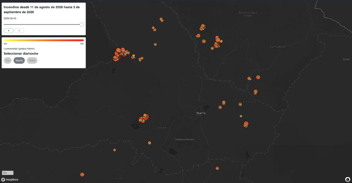
The map is very simple. It’s built using the Mapbox library, which makes it possible to build the interactive map as a single HTML file that can be deployed as a web page. It shows a dark-background basemap so that the hotspots, symbolized in orange, stand out. In the top-right corner there’s a title, and just below it, a slider that lets you add hotspots over time (as of this writing, the map covers the period from August 11 to September 3, 2026). You can interact with the slider manually or use the ‘play/pause’ button to animate it automatically. Below that there’s another panel showing a legend explaining the color of the hotspots, which is measured by the brightness detected by the sensor, in degrees Kelvin. This section also lets you filter hotspots by time of occurrence, day or night.
The reason for including a slider that adds hotspots over time is to visualize how the fires evolve. In some cases they aren’t fully extinguished and last for several days, or can even flare up again. This evolution over time also makes it possible to see whether there’s a pattern in when these fires appear, given that many of them are started intentionally. This is what led to including the filter by time of day. While dry, hot conditions can be conducive to fires of ’natural’ origin, this is significantly less likely to happen at night. Combining these two features — time and time of day — in the map makes it possible to identify patterns that suggest the origin of these fires and possible mitigation measures. Between the original 2023 version and the 2026 one, I introduced one small change. Originally, the data was downloaded manually. This time, a script runs automatically on GitHub and downloads that day’s data. It’s much more efficient for keeping the visualization up to date. The same script reads the date of the last download and fills it into the time slider panel and the map’s title.
View mapAbout the data#
The source of this data is NASA’s FIRMS — Fire Information for Resource Management System. It uses two types of sensors carried aboard five satellites. Worldwide, data can be obtained in near real time, every 3 hours. The sensors, MODIS and VIIRS, can detect frequencies in the mid-infrared range. When the sensor detects a signal in this part of the spectrum, it is actually detecting high temperatures. From that, brightness and temperature can be inferred. This value is recorded for each pixel in the images the satellites capture. The data is processed through an algorithm that identifies false alarms (high values that don’t correspond to high temperatures), the confidence level of the data, the fire’s radiative power, and the time of day. For example, minor temperature variations in areas with high solar radiation may not correspond to actual fires.
FIRMS has its own map for visualizing hotspots or fires in near real time. This is a great resource because it’s interactive and lets you select different data sources, symbology based on time elapsed since detection, ranges of observation days, among other options.
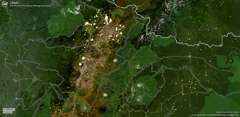
The image shows the last 30 days of observations, with hotspots symbolized according to the number of days elapsed since the data was captured, in the northern highland provinces of Ecuador.
Possible uses for the map#
A map like this one, simple as it is, can be useful in multiple ways. The most obvious is near real-time fire monitoring. Unlike the FIRMS visualization map, the advantage here is that the data is simplified and narrowed down to the area of interest — in this case, Ecuador. While fires can’t be prevented, it is possible to develop strategies to respond to them efficiently — for example, by deploying firefighting teams or volunteers near the areas with the highest occurrence, or by identifying the factors that lead to these events, among others.
Beyond visualization, the daily data can also be used for space-time analyses to better identify patterns and plan the response for the next dry season — for example, by allocating the necessary resources to fire response teams in the areas identified. This is another example of how open data, combined with simple applications, can help support decision-making about the territory.